This week I travelled from Enschede in the Netherlands to Saarbrücken in Germany for a research meeting. On the way I made some observations of usability and user experience in the trains and on the train stations. First we’ll see some examples of bad design, then some good ones!
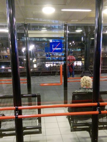
First, a usability classic: Door handles. The waiting rooms at the Hengelo train station had door handles with both horizontal and vertical bars on both sides of the door. With this abundance of handles, I somehow assumed the door would open both in and out. I was wrong, and there was no indication of which way it really openend. Most people will probably just try something random and be right about 50% of the time.
This might seem like complaining over an insignificant problem, but the point is simply to demonstrate principles of building products that people like, whether it’s a door or an iPhone. One part of doing this is to make simple operations (such as opening a door) self-explanatory by design, and not make the user feel stupid — such as when you open a door the wrong way.
Next up was my ticket, which was a print-at-home e-ticket. My Dutch is not so good, but the ticket had a nice illustrated instruction of how I was supposed to scan the ticket at the station:
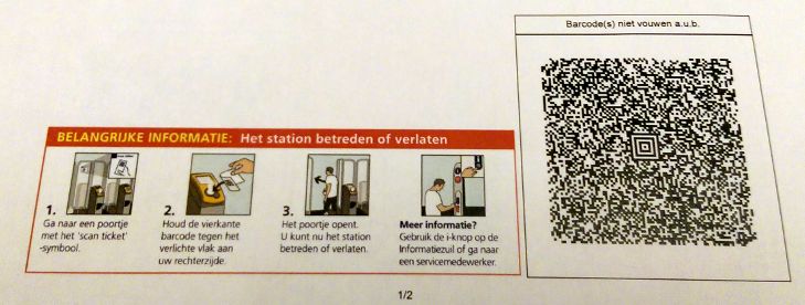
Only there was no scanner in sight on the station. I had plenty of time, so I went to the ticket office to ask what to do. There I learned that this station had no scanners, so I should just board the train without scanning. And this is probably what many people would do. But I didn’t want a misunderstanding to cost me a fine on the train, so I asked. And I was not the first one to worry about it because they had put a piece of paper on the ticket stall window saying the same thing: At this station it is not necessary to scan the e-tickets. I recommended them to put that sign on the platforms where people actually look for the scanners and therefore need the information.
On the train they had a nice info screen. But here I got momentarily confused as well. This was a bit of Dutch I could understand: “Aankomsttijd eindpunt”: Arrival time at the final destination.
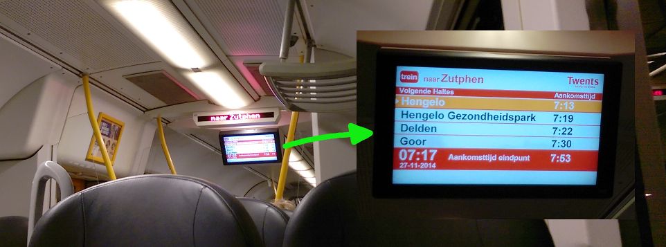
The only problem was that this final arrival time, 7:17, was now. I had entered a train that was already at its destination and not going further. And thereby possibly missed the correct train. Panic! Well, I soon found my misunderstanding: 7:17 was indeed the current time because it was a clock, and the real final arrival time was 7:53.
Besides, why would there be more stops on the list if we were already at the final station? But the point here is not that logical thinking can lead me to the correct interpretation of the information (which is indeed what happened). The point is that before I had read enough from the screen to draw the right conclusion, I had already been startled. The problem comes from our perception that things that are close together belong together. After reading “Aankomsttijd eindpunt”, my eyes were simply drawn to left because the clock was both closer and bigger than the correct arrival time.

Only 20 minutes passed and I already misunderstood three things. How stupid I must be! Well, it’s easy to blame yourself for these things, when in fact the design is to blame. Think about that next time you feel stupid because of your microwave oven.
After I switched trains, I found something nice. Instead of just marking the silent zone of the train as such, the normal zone was also marked as a speaking zone. It’s nice to not only have negative signs with bans, but also positive signs. Who knows, it might even inspire someone to talk to a stranger!
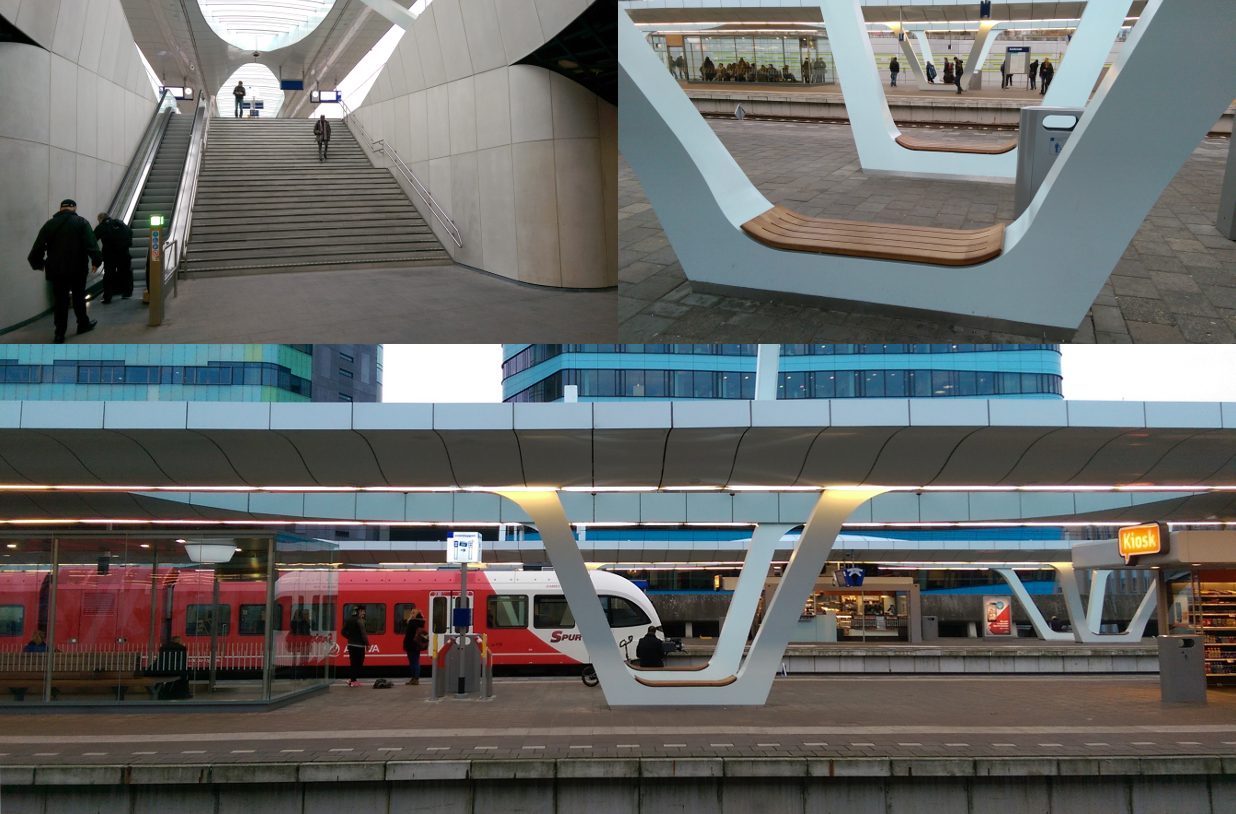
Next up was Arnhem train station. Newly renovated and a good example that a pleasant environment can give you a better experience than a functionally equivalent but ugly environment. Arnhem station was both spacious and elegant (and functional):
Another aspect of train usability is door opening buttons. On the return trip I found two types. The left is from the inside of a Dutch train; the right is from the outside of a German ICE train:
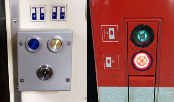
Train doors cannot be opened by passengers while the train is in motion, so the buttons are only active at stations. The left set of buttons leaves the user to guess when they become enabled, while the right set lights up when active, thus displaying their state to the user, including which button is relevant to press (‘close’ when the door is open and vice versa).
Finally, tables. In my previous post I explain how the of table locks in the Danish IC3 trains suck. The Dutch and German ones are better. Dutch on the left, German ICE on the right:

This time I’ll give the first price to the Dutch train. The table has no lock; friction holds the table in place. The edge can be grabbed by either hand, and it is self-explanatory. It can also be folded back up with one hand. The ICE train table is also easy to understand how to use, but physically sliding the lock is slightly awkward. In addition it requires two hands to close; one holding the table, and one operating the lock. (Alternatively, you can slam it shut and make a loud noise!)
Thanks for reading.
The images on this post are by Erik Ramsgaard Wognsen and you may reuse them under the Creative Commons Attribution 4.0 International License. Contact me for higher resolutions.