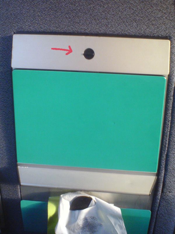
The woman in the seat next to me on the train had trouble folding down her tray table. I showed her how to do it, and she said “Oh, I’ve never been good at that sort of thing.” I said “It’s not you, it’s just bad design.” She didn’t follow. “See, it looks like you’re supposed to turn the knob, but in fact you have to slide it. You just tried to turn it like the design told you to do, but the design was wrong.”
She never seemed to accept my interpretation of the situation. But the fact is that design subconsciously guides us and affects our behavior, for better and for worse. I hope to do a better job here of convincing you than I did with the woman in the train!
The concept of affordance is about what things are for. For example, a hammer affords hitting. James J. Gibson introduced the concept as the possibilities for action that are possible between an object and a user. Don Norman later popularized the idea with a focus on what actions seem obvious (hitting with a hammer), rather that which ones are theoretically possible (say, stirring a pot with it). He did this in his famous — and recommendable — 1988 book The Design of Everyday Things, from which I lifted the title as well as this quote:
Affordances provide strong clues to the operations of things. Plates are for pushing. Knobs are for turning. Slots are for inserting things into. Balls are for throwing or bouncing. When affordances are taken advantage of, the user knows what to do just by looking: no picture, label, or instruction is required.
When affordances and operations match, then the things we interact with work intuitively: We flip the switch, and the light comes on. When things just work, we might not even notice that affordance and operation are two separate things. How could it be otherwise? Well, for example, sometimes we pull a door handle, but the door doesn’t open. The handle affords pulling, but the door opens the other way. It’s when affordances and operations don’t match that we get confused.

The tray table lock in the train had a mismatch between affordance and operation. The round hole surrounding the small plastic handle made the whole thing look like things we normally turn, like the knob on a stove, or a volume knob. But it was actually meant to slide up to release the lock and let the table unfold. Since the small handle is not as wide as the inner diameter of the circle, it is also possible to push the handle up/down. Most users figure this out after a while. But a rectangular shape would likely have given this association from the beginning, without the detour of trying to turn it.
As an example of well-matched affordance, here’s a nice feature on my Braun shaver: Grooves in the plastic make it look compressible, like an accordion. The plastic isn’t in fact compressible, but the supporting springs underneath are. But independently of the mechanical implementation, the design speaks it’s clear language: I’m flexible.

James J. Gibson has some more examples of affordances.
Why Usability Matters
Affordance is related to usability, or, how easy and efficient things are to use. Good use of affordance makes it easy to learn how to use something and less likely to make mistakes. Mismatched or hidden affordances do the opposite. We always make mistakes, but if the design is bad, we make lots more.
Tray tables and shavers are pretty harmless, but human perception works the same way in serious situations. Another example of mismatched affordances comes from the 2000 United States presidential election. The unlucky design of a ballot meant that Al Gore lost some votes he could really have used. Danish ballots also used to have an affordance problem, although it did not favor one candidate over another. The problem was lack of affordance: Ticking a box is just not very satisfying when there’s no box. In addition, inattentive voters might have marked their vote with a ring around a name, thus invalidating their vote because only a cross is allowed.
 by [gepardowa](http://pixabay.com/en/users/gepardowa-320124/) is licenced under [CC0](http://creativecommons.org/publicdomain/zero/1.0/)](/images/posts/cockpit.jpg) Picture by gepardowa is licenced under CC0
Picture by gepardowa is licenced under CC0
You may wonder if this isn’t just a question of paying attention. Or put more bluntly: A question of not being stupid. To some extent, yes. While doing something important, such as voting or controlling a nuclear power plant, it would indeed be sensible to double-check and confirm you did the right thing. But that doesn’t legitimize making a confusing design in the first place. A confusing design can be a waste of time in daily life. This is in itself annoying, but sometimes time is more critical. For example, while controlling an airplane or that nuclear power plant, there can be stressful situations with short time to do the right thing, and no time for double-checking. Even though pilots and operators are trained, it doesn’t mean that they are infallible. Humans will always make mistakes, so the tools we use should not increase the risk of errors.
When human life is not at stake, money is. Usability is also part of designing an attractive product that users want to buy. I say “part of” because, as Don Norman details in his later book Emotional Design, usability relates to our brains’ behavioral thinking, but there are two more “brain levels” to satisfy to make a truly successful product. Once the product itself is good enough, its website must also have good usability and be a good overall user experience. Jakob Nielsen, a colleague of Don Norman, is known to say that “a bad website is like a grumpy salesperson”. Web usability and user experience design are fields of their own, but they are based on human cognition, just like the design of everyday things.
Once you are aware of the concept of affordance, you might start looking for it in your surroundings.
I suspect Danish people reading this might remember a more obvious usability problem in the Danish IC3 trains, besides the tray table:
The doors between compartments are sliding doors, with no handles or buttons.
This is not uncommon; automatic sliding doors typically open when we approach them.
But these don’t do that either.
So, what do you do with products that are not self-explanatory?
Of course you fix them provide instructions!
Don’t Make Me Think
(I noticed that Don’t Make Me Think is also a book about web usability. I have not read it, but I fully agree with the message of its title! And it doesn’t apply only to web usability.)
 by [Russ Morris](https://www.flickr.com/photos/russmorris/) is licensed under [CC BY-NC-ND 2.0](https://creativecommons.org/licenses/by-nc-nd/2.0/)](/images/posts/pushpull.jpg) Push Pull by Russ Morris is licensed under CC BY-NC-ND 2.0
Push Pull by Russ Morris is licensed under CC BY-NC-ND 2.0
A classic example of usage instructions is push/pull signs on doors. Using affordance properly, it is wholly possible to design a door where the shape and position of the handles and the design of the frame subconsciously guide us to push when and where we should push, and pull when and where we should pull. One way is to use a handle that is easy to pull on one side, and on the other side a handle that is easier to push — possibly a plate or bar that can only be pushed. But while it is possible, that doesn’t mean it is always done in practice. Maybe nobody knew. Or maybe it was just cheaper to put the same handle on both sides. But probably the first. So when it is discovered that the door works poorly and people want to improve it, they add the instructions. However, Norman writes:
Complex things may require explanation, but simple things should not. When simple things need pictures, labels, or instructions, the design has failed.
But why are instructions so bad? Or at least potentially unnecessary instructions such as push/pull signs? One problem is that when a task requires us to read and think more than what is necessary, it distracts us from thinking about more important or urgent matters. This is especially important in those stressed situations, I have already mentioned. But reading is also harder than picking up clues from physical shapes. Our brains have evolved and adapted to a tangible environment, and reading is relatively new, and not as “efficiently implemented”.
But it turns out all instructions are not equally bad. Here’s a door I came across in the Gromada Airport Hotel in Warsaw:

I think the 3D effect of the arrows can actually help speak directly to our spatial intelligence, bypassing the need for reading and language processing. (Of course it helps that I don’t read Polish!) I think if the text was removed, the arrows might work as well as well placed door handles, if not as elegantly. But I’m probably too conscious about these subconscious things to be a good judge. It would be up to user testing to tell.
While instructions are typically employed to meet the lack of affordance, they can also be used when there’s unwanted affordance:

(This particular revolving door at the NH Utrecht hotel was however spinning so fast I had a hard time seeing why anyone would feel the need to push it. I think it shows in my blurry picture.)
Of course, most rule signs follow from some action being afforded by the environment, but deemed unwanted. Some rules are perhaps better enforced by removing the affordance. For example, a narrow or curvy road does not afford driving at high speed. (Neither do roads with speed bumps, because the bumps afford unpleasant bouncing and perhaps damaging the car.)

We already established that it’s better to guide the user with affordance than with instructions, but some things may be too complex to rely solely on affordance. In those cases we might be asked to read instruction manuals instead of a single pictogram or sentence. However, that doesn’t remove the problems with instruction: They stand between us and what we want to do.
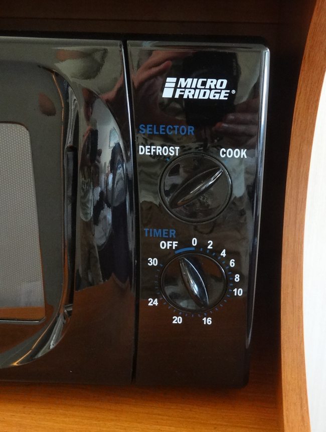
So the less the text, the better. Case in point, here is a microwave oven that I think most people could use without a manual. (It’s just a pity that the brand name MicroFridge could suggest the device is a fridge! Alas, it probably doesn’t matter anyway, because…)
The biggest problem with instructions is that, most of the time, people don’t read instructions!
This is why affordance was important in the first place, along with many other concepts related to usability such as mental models and feedback to the user about the state of the system.

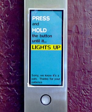
Finally, an example that you can even have bad usability and still make your users (at least the ones who read!) walk away with a smile. I found it next to the elevator in the HI-San Francisco Downtown hostel. (The quality of the signage in that place almost made up for the quality of the breakfast!)
In conclusion, products that are compatible with our brains’ autopilots work really well. Part of achieving that is matching affordance to the functionality of the product. This attention to detail is the difference between something that simply functions and something that really works.
I have presupposed that the products do function correctly. This is of course far from always the case, especially in complex systems. In fact, the field I do my PhD in, formal methods, is exactly about proving that complex computer controlled systems function as they are supposed to. This in itself can require an enormous effort, but as we have seen in this post, correct functioning should be matched by good usability.
Except where it says otherwise, the images on this post are by me, Erik Ramsgaard Wognsen, and you may reuse them under the Creative Commons Attribution 4.0 International License.